A picture is worth a 1,000 words.
It’s cliché but it’s true. Data visualization is all the rage. People find it helpful to see a visual depiction of information then drill into the details to learn more about the story.
How many reports are sitting on your shelf in a pretty binder (hard copy or electronic)? How often to you refer to them? Did you act on the recommendations of the assessments?
While I am sure our clients hang on every word we write, a picture helps summarize information and draw attention to important points.
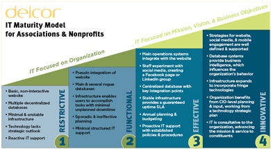
The DelCor IT Maturity Model is a tool that we use on a regular basis when we are preforming technology assessments.
The model provides the association with a snapshot of how their organization is performing compared to others in association community and helps focus attention on the areas that are most at risk.

The model provides a quick view of 4 major areas:
- Network/Infrastructure
- Data
- Online/Digital
- Management
Each area is assessed for its maturity
- Restrictive
- Functional
- Effective
- Innovative
While this summary is useful to the executive team, it also helps other staff members understand the overall maturity and function of each area of the association IT infrastructure.

Of course it’s difficult to take action on a high-level summary. We layer details related to key functional areas to paint a fuller picture with relevant examples and references that help the association understand how our research and recommendations relate to a specific process or function. For example, while findability is key to a successful website, readability is critical to a report.
If an association is collecting a lot of data but the quality is poor or incomplete, it’s a waste. Volume does not equal quality.
When I am developing a report for a client, I try to break up information so it’s easy to read. In addition, I have to consider the audiences who may read the report and attempt to provide several examples and options for those diverse audiences.
In many cases, we are helping associations develop concepts to build a solid framework so they have a path to maturity.
The last element I add to as many reports as possible is the ‘so now what do I do?’ section. I help the client prioritize recommendations so the association can develop a plan to act. If an association has several areas that require a lot of work, they may opt to focus on smaller projects, then revisit the larger discussion.
As you may have noticed from many of our blog posts, we love to break things down here at DelCor. In this case, it is all about making the data digestible; there is incredible information in those data, reports, and recommendations – but leadership, staff, and work groups must be able to excavate the actionable nuggets.
Images help – they act like treasure maps. What pictures and other tricks do you use to make data and recommendations understandable and actionable so they don’t die in pretty binders while problems and opportunities lie in wait?

Argh!
Lego pirate photo by Fanboy30
